响应式设计介绍
响应式设计(RWD)从2010年开始就逐渐进入人们的视线,虽然由于网速和网络的制约,目前国内都是采用针对pc和移动分别开发站点的策略,例如淘宝网的首页在pc端网页 ,在移动端的网页为网页,使用的是基于REM的布局设计。但是没人能否认响应式设计的重要性和简便性。响应式设计其实简单来说就是利用media query针对不同的设备和分辨率采用不同的css样式,用以达到网站在各个设备上的兼容性,再结合“移动优先”的策略,使得响应式设计更加的具有优势。
一个响应式设计的实现
下面就举一个简单的响应式网站的例子。
代码见f2e-testing
- 首页welcome页面
- 登陆页面
- notes列表页面
- 新建note页面
公共头尾和菜单的响应式实现
这个属于很经典的响应式菜单和标题设计:
- 首页中如果是mobile或者ipad 则只显示标题的主要部分
- 菜单中如果是大屏,则一行显示菜单,mobile下用两行的菜单
- css完整实现:参见
1 2 3 4 5 6
| <div id="header"> <div class="middle-wrapper"> <img id="header-logo" src="../src/assets/header-icon.png"> <h1> Sample Website <span class="not-on-mobile not-on-tablet">for Galen Framework</span></h1> </div> </div>
|
1 2 3 4 5 6 7 8 9 10 11 12 13 14 15 16 17 18 19 20 21 22 23 24 25 26 27 28 29 30 31 32 33 34 35 36 37 38 39 40 41 42 43 44
| #menu { background: url("images/menu-background.png"); margin: 0; color: white; } #menu ul { margin: 0; padding: 0; list-style: none; } #menu li { display: inline-block; } #menu ul:after { clear: both; } #menu li a { min-width: 100px; font-size: 1.2em; color: white; padding: 20px; display: inline-block; } @media (max-width: 500px) { .not-on-mobile { display: none; } #menu { width: 100%; } #menu li { width: 49%; } #menu li a { width: 100%; } } @media (max-width: 800px) { .not-on-tablet { display: none; } }
|
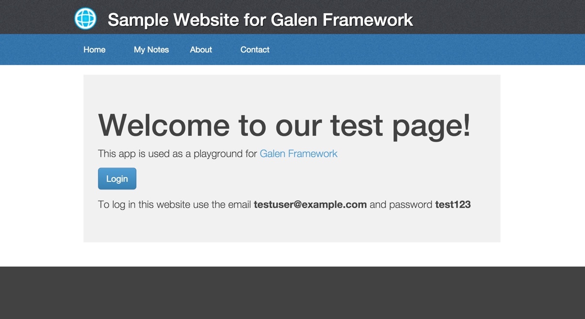
welcome页面
welcome页面:使用的是bootstrap的jumbotron的布局,这款响应式布局
主要用在simple marketing or informational website。它具有一个通知的大型“布告栏”(jumbotron)和三栏式布局。
主要的实现代码:
1 2 3 4 5 6 7 8 9 10 11 12 13 14 15 16
| <div class="middle-wrapper"> <div id="content"> <div id="welcome-page" class="jumbotron"> <h1>Welcome to our test page!</h1> <p>This app is used as a playground for <a href="http://galenframework.com/">Galen Framework</a></p> <p> <button class="btn btn-lg btn-primary button-login" type="button" onclick="App.showLoginPage();"> Login </button> </p> <p>To log in this website use the email <b>testuser@example.com</b> and password <b>test123</b> </p></div> </div> </div>
|
1 2 3 4 5 6 7 8 9 10 11 12 13 14 15 16 17 18 19 20 21 22 23 24 25 26 27 28 29 30 31 32 33 34 35 36 37 38 39 40 41 42 43 44
| .jumbotron { padding: 30px; margin-bottom: 30px; color: inherit; background-color: #eee; } .jumbotron h1, .jumbotron .h1 { color: inherit; } .jumbotron p { margin-bottom: 15px; font-size: 21px; font-weight: 200; } .container .jumbotron { border-radius: 6px; } .jumbotron .container { max-width: 100%; } //大于768px @media screen and (min-width: 768px) { .jumbotron { padding-top: 48px; padding-bottom: 48px; } .container .jumbotron { padding-right: 60px; padding-left: 60px; } .jumbotron h1, .jumbotron .h1 { font-size: 63px; } } @media (max-width: 500px) { button { width: 100%; margin-top: 10px; } }
|
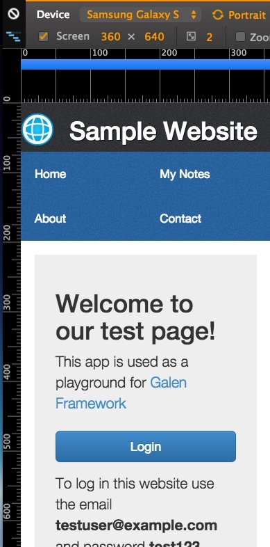
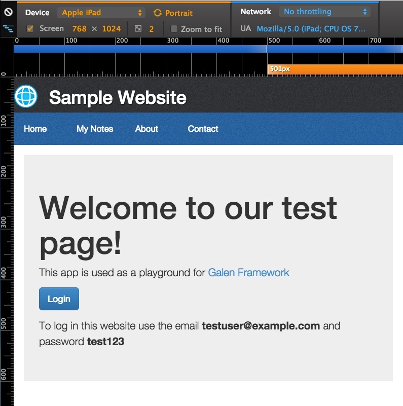
login登陆页面
![] (http://gtms03.alicdn.com/tps/i3/TB1zvDUKpXXXXXvXpXXkao1KVXX-359-598.jpg)
![] (http://gtms04.alicdn.com/tps/i4/TB1ZwPVKpXXXXanXpXXCIO.HpXX-1135-533.jpg)
1 2 3 4 5 6 7 8 9 10
| @media (min-width: 501px) { .dialog-panel { width: 400px; border: 1px solid #ccc; padding: 20px; margin: auto; border-radius: 10px; box-shadow: 1px 3px 3px #ddd; } }
|
响应式兼容尺寸
1 2 3 4
| <meta name="viewport" content="width=device-width, initial-scale=1"> <meta name="viewport" content="width=device-width, initial-scale=1, maximum-scale=1, user-scalable=no">
|
- 使用hack兼容低版本浏览器的media query
1 2 3 4 5 6 7
| <script src="https://oss.maxcdn.com/libs/html5shiv/3.7.0/html5shiv.js"></script> <script src="https://oss.maxcdn.com/libs/respond.js/1.4.2/respond.min.js"></script> <![endif]-->
|
- 参考bootstrap 3 它优先使用“移动优先”原则,详情:参考
- Extra small devices ~ Phones (< 768px) col-xs-
- Small devices ~ Tablets (>= 768px) col-sm-
- Medium devices ~ Desktops (>= 992px) col-md-
- Large devices ~ Desktops (>= 1200px) col-lg-
1 2 3 4 5 6 7 8 9 10 11 12 13 14 15 16 17 18 19 20 21 22 23 24 25 26 27 28 29 30 31 32 33 34 35 36 37 38 39 40 41 42 43 44 45 46 47 48 49 50 51 52 53 54 55 56 57
| @media only screen and (min-width : 320px) { } @media only screen and (min-width : 480px) { } @media only screen and (min-width : 768px) { } @media only screen and (min-width : 992px) { } @media only screen and (min-width : 1200px) { } @media only screen and (max-width : 1200px) { } @media only screen and (max-width : 992px) { } @media only screen and (max-width : 768px) { } @media only screen and (max-width : 480px) { } @media only screen and (max-width : 320px) { }
|
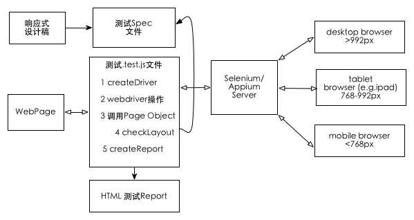
响应式设计的自动化测试框架 - galenframework
介绍
- 用于响应式设计的开源UI自动化测试框架
- 测试spec “语义化友好”,通过位置信息准确定位各个元素的位置
- 测试用例API兼容java和javascript
- pc端和无线端多尺寸兼容,支持selenium appium saucelab browserstack多服务器测试
- 可自定义输出的测试 html report
安装
- 下载二进制代码
- 执行 ./install.sh
- galen -v 显示如下命令行 表明安装成功
1 2 3
| Galen Framework Version: 2.1.2 JavaScript executor: Rhino 1.7 release 5 2015 01 29
|
测试环境建立
- 执行 galen config:生成config文件用于配置初始化文件,具体参数配置 详情参见
- 文件结构
- tests文件夹:用于装载测试脚本
- init.js: 用于配置测试的设备和尺寸
- pages文件夹: ui自动化测试的Page Object页面
- login.page.test.js(默认是以.test.js后缀作为测试文件,如果有特殊要求可以在config文件中配置)
- specs文件夹: 用于装载响应式设计的规则spec文件
- common.spec文件:
- loginPage.spec文件等等
- config文件:配置文件
- reports目录:用于生成自动化测试的html结果
构建测试服务
- appium作为mobile的测试服务器,android真机测试的服务搭建,参考
- selenium作为pc端的测试服务器
1 2 3 4
| #server端:8002端口启动三星galaxy SIII设备的测试服务器;8001端口启动IPAD模拟器;启动chromepc端的测试服务器 node . -a 127.0.0.1 -p 8002 -U 4df752b06833bfd3 --browser-name Chrome --no-reset node . -a 127.0.0.1 -p 8001 --command-timeout 50000 --no-reset selenium-standalone start
|
#客户端:测试 并且测试完成后浏览器打开测试结果
Galen的命令行运行,参考
- galen check:运行spec
- galen test: 运行测试用例
- galen dump:生成可视化spec-
1 2 3 4 5 6 7 8 9 10 11 12 13 14 15 16 17 18 19 20 21 22 23 24
| galen test mytest01.test --htmlreport "htmlreport-dir" --testngreport "report/testng.xml" --jsonreport "jsonreport-dir" --parallel-tests 4 galen test tests/ --htmlreport reports galen check homepage.gspec --url "http://example.com" --size "640x480" --javascript "some.js" --include "mobile,all" --exclude "toexclude" --htmlreport "htmlreport-dir" --testngreport "report/testng.xml" --jsonreport "jsonreport-dir" galen dump "specs/homepage.gspec" --url "http://galenframework.com" --size "1024x768" --export "dumps/homepage-dump" --max-width "200" --max-height "200"
|
测试流程
createGridDriver建立对服务器的链接,并启动driver
1 2 3 4 5 6 7 8 9 10 11 12 13
| var driver = createGridDriver('http://127.0.0.1:8001/wd/hub',{ desiredCapabilities: { browserName: 'Safari', 'platformVersion': '9.1', 'platformName': 'iOS', 'app': 'safari', deviceName:"iPad Air", size: '600x800', safariInitialUrl: 'about:blank' } }); driver.get("http://test.xxxxx.com");
|
checkLayout连接spec文件和.test.js测试文件
检查spec文件是否符合预期
1 2 3 4 5 6 7
| test("Simplest test", function () { }); checkLayout(driver, "specs/welcomePage.spec", ['desktop']);
|
使用 Page Object Model
PageObject在selenium中是常见的设计模式,它可以快速的将测试用例和测试主体相互分开,通过复用,减少代码;同时可以把测试过程变化的参数在统一的地方配置,减少改动的成本。关于 Page Object我会再开文介绍,这里只为大家介绍在galenframework中我们可以如何快捷的定义我们的PageObject,以登陆页为参考:
$page(pageName, primaryFields, [ secondaryFields ])
1 2 3 4 5 6 7 8 9 10 11 12 13 14 15 16 17 18
| this.LoginPage = $page("Login page", { email: "input.email", password: "xpath: //input[@class='password']", submitButton: "id: submit", load: function () { this.open("http://example.com/login"); return this.waitForIt(); }, loginAs: function (userName, password) { this.email.typeText(userName); this.password.typeText(password); this.submitButton.click(); } }); var loginPage = new LoginPage(driver).load(); loginPage.loginAs("testuser@example.com", "password");
|
页面的webdriver操作函数
参考 GalenPage.js
- 针对于$page这个对象
- open 打开页面
- waitForIt 等到primaryFields的元素都
- wait({}).untilAll({}); 等
- getAllLocators:把
- findChild 定位元素
- findChildren 批量定位元素
- 针对pageElement(primaryFields还有secondaryFields中的元素)
- attribute 获取属性
- cssValue 获得css属性值
- typeText input输入内容
- click 点击按钮
- clear 清空input
- getText 获得输入的内容
- hover
- getWebElement
- findChild
- findChildren
- isDisplayed 元素是否展现
操作并输出到report中
- logged(text, callback)
- loggedFunction(textExpression, callback)
1 2 3 4 5 6 7
| loggedFunction("Log-in as ${_1} with password ${_2}", function (email, password) { this.emailTextfield.typeText(email); this.passwordTextfield.typeText(password); this.submitButton.click(); });
|
spec文件编写
spec文件是用于描述元素css之间的各种关系,符合语义化的要求,详情 参考
- 定义Objects:@objects
- tags和sections:= Main section =
- 变量 @set
- import其他的spec文件规则:@import header.spec
- forEach Loop:循环
- near - checks that object is located near another object
- below - checks that an element is located below other object
- above - checks that an element is located above other object
- left-of and right-of - checks that an element is located above other object
- inside - checks that object is located inside another object
- width - checks the width of object
- height - checks the height of object
- aligned - checks horizontal or vertical alignment of object with other objects on page
- text - checks the text that is visible on page
- text is - checks that text is exactly as expected
- text contains -checks element contains expected text
- text starts - element should start with expected text
- text ends - element should end with expected text
- text matches - verifies that text matches Java Regular Expression
- centered - checks that object is centered inside another object
- absent - checks that object is either missing on page or is not visible
- contains - checks that object visually contains other objects inside it
- on - checks that object is visually located on other object
- component - runs a subset of specs from another file within the given object context
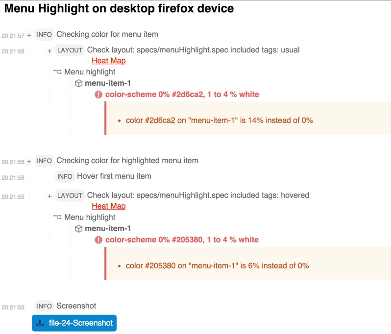
- color-scheme - checks the color distribution in the given object area
1 2 3 4 5 6 7 8 9 10 11 12 13 14 15 16 17 18 19 20 21 22 23 24 25 26 27 28 29 30 31 32 33 34 35 36 37 38 39 40 41 42 43 44 45 46 47 48 49 50 51 52 53 54 55 56 57 58 59 60
| @objects search-panel id search-bar search-panel-input xpath //div[@id='search-bar']/input[@type='text'] search-panel-button css #search-bar a menu-item-* css #menu li a = Main section = @on * menu: height 70px @on mobile login-button: width 100px @on mobile, desktop menu: height 300 px @set commonHeaderMargin 10 to 20px contentMargin ~ 20px # Approximate = Header = header-icon: inside header ${commonHeaderMargin} top left textfield: near button 5 to 15px left # By top edge menu-item-1: aligned horizontally top menu-item-2 # iframe中定义spec @objects banner-frame css iframe#banner = Main section = banner-frame: component frame banner.spec # color scheme login-form: color-scheme 10% white, 4 to 5 % black, < 30% #f845b7 # image menu-item-1: image file imgs/menu-item-1.png, error 4%, tolerance 80 # 循环 = Main section = @forEach [menu-item-*] as itemName, prev as previousItem ${itemName}: right-of ${previousItem} 10px @for [ 1, 2 ] as index menu-item-${index}: above menu-item-${index + 2} 0 to 5px
|
完整的例子